


I have a cold. You all should lockdown now.
Some people think our immune systems need to be challenged.

I have an irritated sort of throat that extends up to my red, watery eyes that squint in the light. Covid didn’t do that.
My desperate sudden lunge for a tissue wakes me from sleep. Covid didn’t do that.
With covid I did the gargles and nasal sprays and had no symptoms, apart from the fever. I thought every cold from then would be easy, but this cold pays no regard to those simple treatments.
As Rowan Atkinson’s character said as he was being burnt at the stake, fidgeting around on the faggots, “I’m not even comfortable”.
And at least when I had covid people cooked me dinner while I was locked in my room. But here I am, feverishly watching onions fry.
I wish, I wish for those days of lockdown, when we didn’t have colds. And arriving in my inbox was Australian Federal Health “Communicative Diseases Intelligence” update, epidemiological report, reminding me of the good old days…

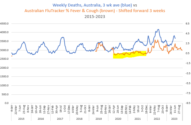
Or, as I like it better presented in Australian FluTracker Network reports, covering 2019 through to last week, with my additional red arrows…

I like this graph so much that I went through the FluTracker weekly reports over years to get the actual numbers so I could plot the graph myself. The problem was that the variable on “Fever & Cough” was inconsistently published before 2019. But as you see, it’s “twinsies” with the Australian weekly death numbers, when delayed three weeks (the time between the community coughing and the frail dying).
I wanted to get the rest of the FluTracker numbers for 2015-2018. I want to show everyone that the death curve throughout matches the % of people coughing. I wrote a very polite letter to them, but the request was denied. They don’t give data to people such as me.
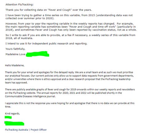
I ask you to take my word for it that, likewise, the “Fever & Coughing” of 2015-2018 beautifully describes the wave on the death curve. While denying me the numbers the network have published the graphs to the whole world - it’s just not easy to use them. Here are the graphs - I’ll try to work them in elegantly when I don’t have a cold.

Now, just because frail people have ‘caught the cough’ it doesn’t mean their death gets attributed to an underlying cause of influenza, or pneumonia - their death is more typically attributed to whatever underlying cause is making them weakest. So those waves on the death curves are barely influenced by the numbers of people given an underlying cause of death of “Influenza”.
Anyway… Can the graph readers see where I’m going with this? The incredibly low “Fever & Cough” in the public in 2021 informs that great big lump of deaths in 2021, at a time when there was no covid.
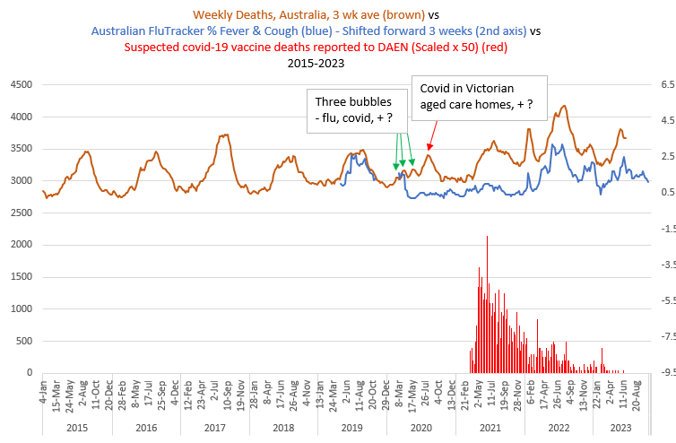
I’ve been pondering the question of how much ‘postponed deaths’ contribute to that 2021 lump. The low infections and greater hygiene measures of lockdown also meant other infections (bacterial, fungal) that could contribute to a pneumonia death in a frail person were minimised. Some people think being denied access to germs is a bad thing for our immune system, but I’m not convinced that’s the case in the frail elderly. Responding to a challenge is just a thing we have to do, and I’m feeling it taking a few months off my life right now. I even wonder if the frail could become healthier when they’re not under an incessant immune challenge from their daily carers. Think about that one - I have been. What it does mean is that those on a steady decline from an underlying condition such as dementia were more likely to fall to that severe immune shock when it actually came via a needle in the arm. I think there’ll be a way to see this in the data.