


The 0-64s haven't died yet
The architects of "The Plan" might want workers :)

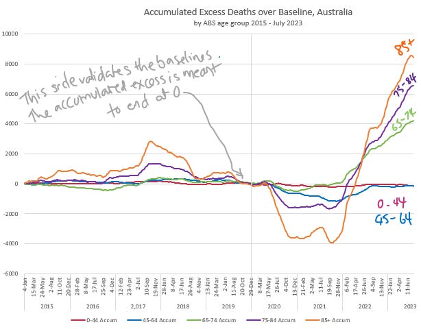
I wasn’t expecting to see this but if “The Plan” in Australia is to only eliminate people over working age it’s going very well. Here in Australia the 0-44 and 45-64 age groups have zero net excess death over the pandemic (since January 2020).
[Note: There is some sad material on Cause of Death in this - don’t read if you feel vulnerable]
Here are the actual weekly deaths (provided by the Australian Bureau of Statstics) vs calculated baselines, by age group. The 0-44s are 45 years worth of young population, with very few deaths, and the 45-64s are 20 years worth of population, mostly ditto.

And here are the accumulated excess deaths, by age group. So far the net result of the pandemic for the 0-64s is nothing. There is no excess death to blame on covid, nor on the vaccines, nor on the pandemic measures. But, even though it’s just a decade on, and only a ten year age group band, the excess deaths for the 65-74s are right up there.
Why was I digging around?
I only meant to investigate the Under 45s. The Actuaries Institute Covid-19 Mortality Working group had said in their August 2022 publication that non-Covid-19 excess deaths were occurring in the under 45s, and that this is probably a sign of covid-influenced deaths. This suggestion was wild to me. You and I would probably form a first hypothesis that they were un-noted vaccine deaths.
But at a quick glance I could see no lift in death rates outside a usual statistical variation.
This is the sad stuff - don’t read if you feel vulnerable...
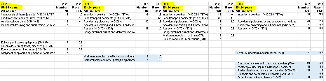
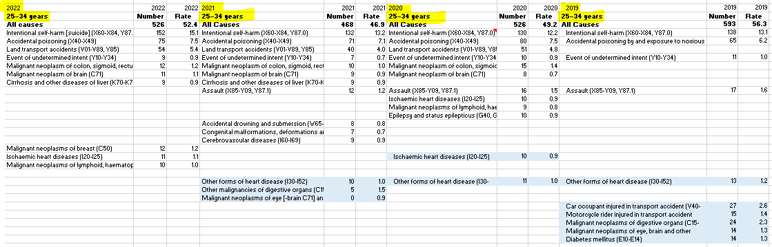
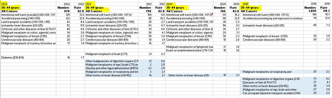
I happened to know that the leading causes of deaths in the 15-24s, the 25-34s and the 35-44s, year after year, are intentional deaths, accompanied by the usual land traffic accidents, accidental poisoning (overdoses, etc), drowning accidents, assaults, that dominate the thinly dispersed medical causes. I thought that if there was a covid-influenced death it would barely be noticed in the random fluctuations of these non-medical deaths. The same would apply to vaccine deaths, and we certainly wouldn’t get the data to discern it.
I don’t know if you’ll be able to read this but I’ve been collating data on Leading Cause of Death, by State, by Age Group. These are from Victoria, 2022 back to 2019. Unfortunately the format changed from 2019 to 2020 and they are hard to compare.
On similar lines, the 0-44s also include the babies who don’t make it to 1 - those with issues from the perinatal period, congenital difficulties, and SIDS. If it’s a big birth year there’ll be a surge in infant deaths that could obliterate other smaller trends.
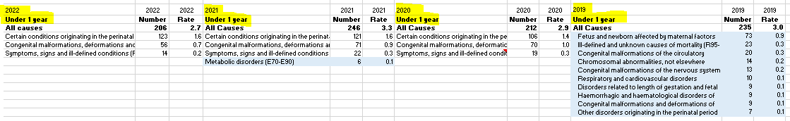
And for the healthy 1-14s, they are caught up in accidents of various kinds, still subject to congenital difficulties, as well as childhood cancers, sadly…

The other thing that happens in this age group is massive fluctuations in population. The international students come and go at regular intervals, not here in 2021, and they are not all well-balanced (a bit stressed with expectation in a foreign country).
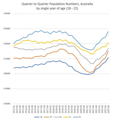
Most new immigration happens in this category. The difference between the 2022-Q4 population and the 2023-Q1 population is crazy, almost 144K more people in one quarter! Thus I can’t guarantee the 2023 numbers I present here because I have no idea where the 30 June population will be.
Anyway, on Actual Deaths vs Baseline, this is the way the 0 - 44 year age group looks. Chaotic - even though the data is on a 5 week average - and no particular seasonality. And with all randomness, all craziness brought together, it all works out to have no accumulated excess deaths in the pandemic years.
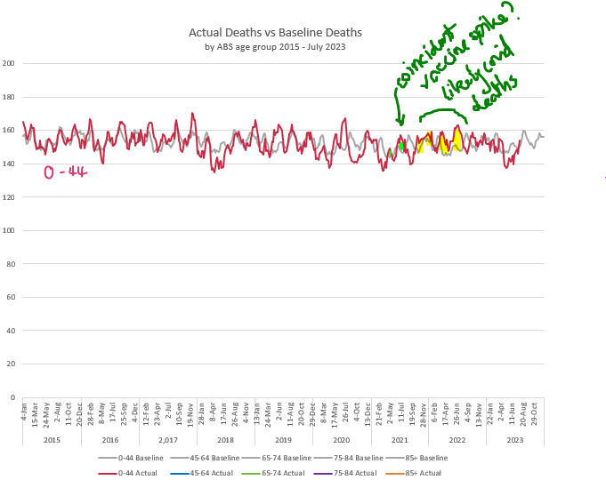
There were some covid deaths in this age group*, in all the years of the pandemic - there is a sign of a protracted period of slightly-above the baseline deaths through the heaviest covid period. There is a spike coincident with the vaccine rollout, but there are spikes everywhere, right? Some of these deaths may be obscured due to the reduction in other deaths - accidents were hard to come by during lockdowns, and not so many children rushed to hospital with bad flu reactions, so perhaps vaccine- and covid-assisted deaths were compensated by these, and less invisible in the whole picture.
* I haven’t found numbers for this exact age grouping - ballpark - 15 in 2020, 25 in 2021, and 120 in 2022.
And the rest of the workers? The 45-64 year olds?
They seemed to thrive on their ‘work from home’, saw a 22% plummet in ischaemic heart deaths in Victoria…
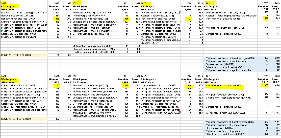
…they got their vaxes, died from covid, and then went completely back to normal - let’s hope it stays that way.
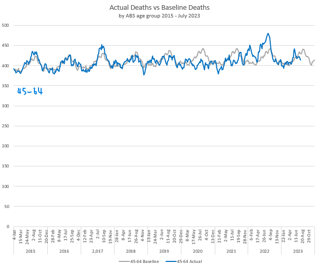
I’m only surprised to see no gradation in excess mortality to this group, above the flat line of the younger group.
The End.
Another great post👍
FYI - There is site that could take some of the hard work out of graphing things manually or just having a quick look at some “what if” scenarios. It’s called the Human Mortality Database. It has some nice features you can use to quickly do things like changing the base line years, split male female, age bands, raw counts and age adjusted rates etc. You can also includes different counties for comparison. However, it doesn’t break it up by state like you have.
https://mpidr.shinyapps.io/stmortality/
Great analysis - thank you!
We all know that statistics can be manipulated - intentionally or not. I've been following all the other analyses of the figures. I did have some training in stats back in my Uni days, but I'm not a mathematician by inclination. So I'm just following all this with a lot of interest & an open mind.
I'm a baby boomer myself, and in that excess death band (still healthy, unjabbed, and fully recovered from my one bout of covid). I can understand why they might want to be reducing our numbers in the demographics, but I'm not going to cooperate!