


Were Australian states trialling different covid vaccine mixes?
Western Australia and Tasmania have no Pandemic excess mortality - it's really weird...

Did the National Cabinet (or the pharmaceutical mafia, or whoever) try three different vaccine mixes/pandemics in Australia?
This is Accumulated Excess Deaths by State (effectively since January 2020), over the Baseline (Population Method). It’s in Standard Deviations so it’s comparable for different population sizes. I’ve seen a lot of graphs in my life and I’m shocked to see this cluster…
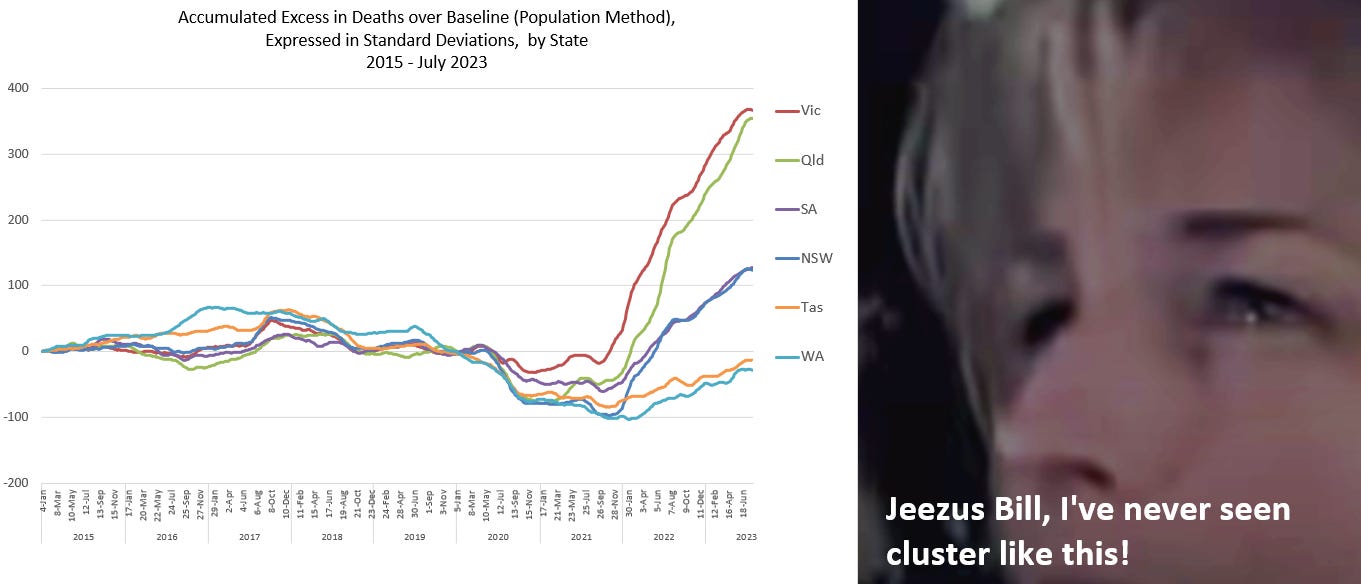
Victoria (Vic) (think rubber bullets) and Queensland (Qld) cluster with the highest rate of excess deaths. Then South Australia (SA) and New South Wales (NSW) cluster, with the middle rate. And then Tasmania (Tas) and Western Australia WA) still haven’t got above zero - no net excess deaths across the pandemic period.
I’ll investigate the “Why?” at the end.
What started the investigation?
I read some analysis on the Western Australia covid-19 experience and I wanted to compare it to other states. I used data from the Provisional Mortality Statistics “Deaths by Week of Occurrence”, by State/Territory, and put the state data together in a way that promoted comparison.
In the image below, graph 1 is the raw data, graph 2 is the averaged data to make it cleaner, especially in the smaller states, graph three has the 2015-2019 (pre-pandemic) trends, with projections into the future at the same rate. Graph 4 shows where these trends fit in the weekly data.

I was at first interested in Western Australia, but as you see in graph 4, it is nearly invisible. NSW, Vic and Qld are the three biggest states, SA and WA follow, then Tasmania in the orange, followed by the two small territories (Northern Territory and Australian Capital Territory).
Here is the Western Australian data on it’s own. It really looks as though the deaths are shooting above the trend, with the vaccine rollout in 2021, and covid (eventually hitting once the borders were opened) in 2022. They are doing that, but Trend has an issue…

I took the next step so I could compare all the states/territories together.
In the image below, graph 1 is a zoomed in shot of the graph above. The arrows show the intent to calculate the Excess Deaths above and below the trend (positive and negative). These values are plotted in graph 2. It certainly looks like there is a lot of above-trend death from 2021 onwards, in Western Australia. To compare, I did the same thing with the data from all the other states and territories, shown in graph 3 below.
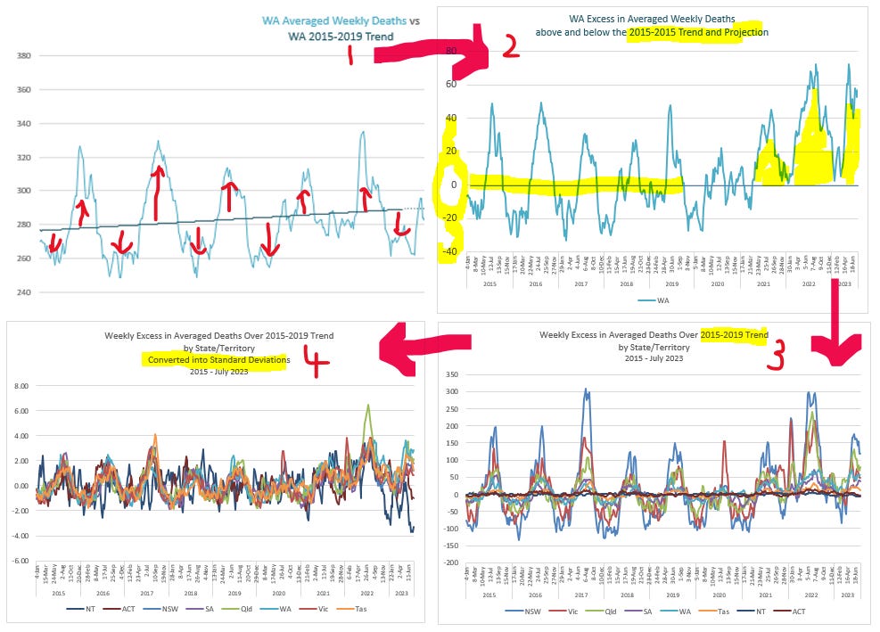
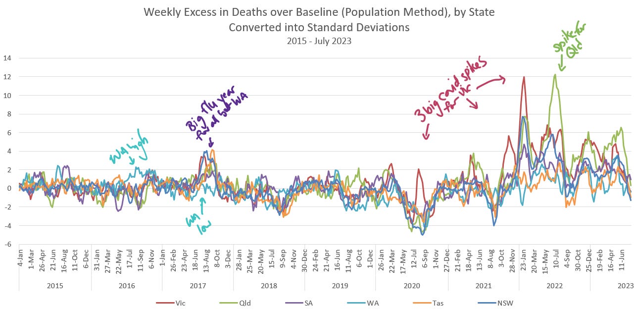
Even though the Excess above and below the Trends are now plotted on the same baseline, at zero, the waves of New South Wales are much bigger than the others, so a further layer of resolution was needed. Thus I converted the excess into Standard Deviations, and voila! they sit together in graph 4. But what a mess!
I deleted the territories off the graph because the data in these smaller regions is chaotic, and after a lot of auditing, unreliable. The pic below is now legible. We can look at where the States’ experience varies above and below their Trends, over the last 8 years
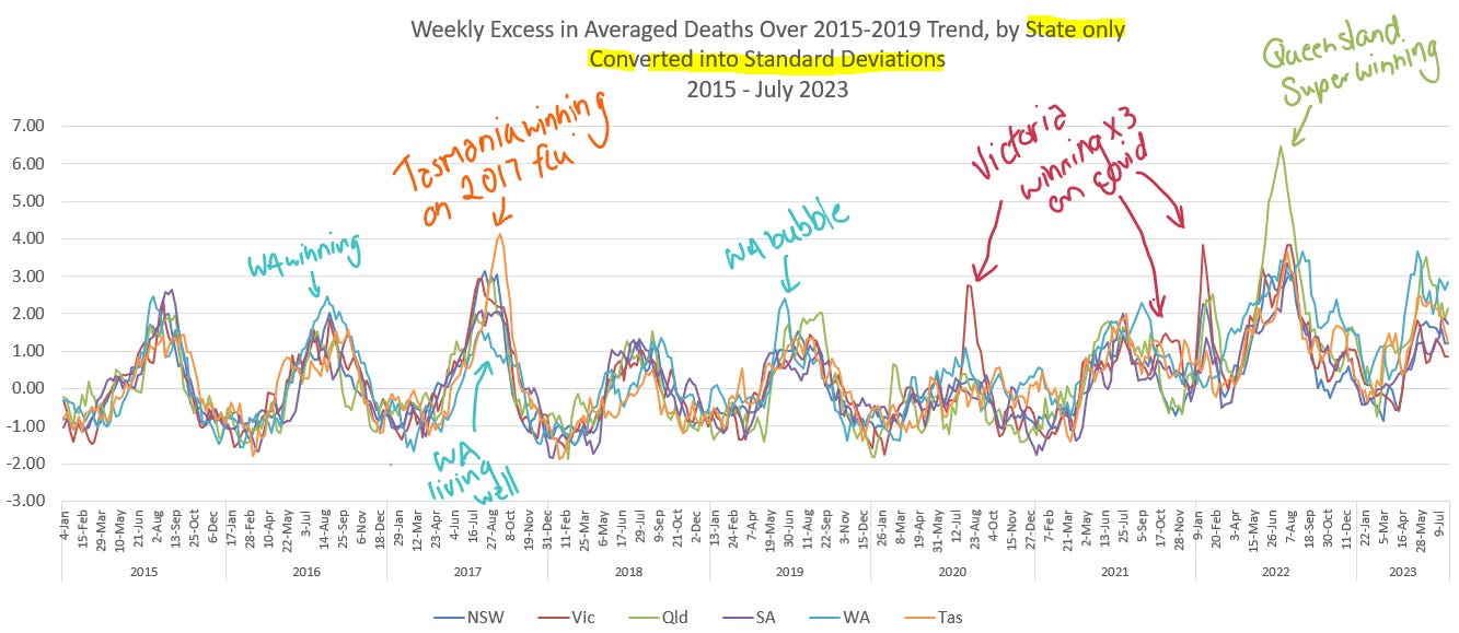
Just saying first, this graph does not give a true representation of “excess death”. It’s only useful for showing where states differ from each other. I’ve noted a few points on the graph. Western Australia had a relatively bad year in 2016, and then, compared to the rest of the States a quiet year in the flu shocker of 2017. Victoria and Queensland have massive covid peaks, but where is NSW? Nothing big? Nothing out of the ordinary for a State of its size?
Anyway, I was comparing the experience of the States one by one with Victoria, and I was fairly stunned to see that Western Australia’s excess above their trend looked like it would be far bigger (as an accumulated sum) than Victoria’s.
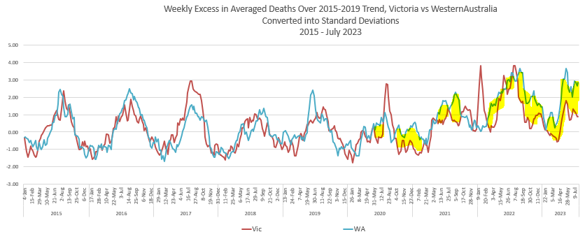
So I ran a comparison between all the States on this Projected Trend method of analysis. On this Trend analysis I found that WA had the highest Excess of all the States. As it turns out, there was a false assumption in this method, but I didn’t know that at the time, and I wondered if they’d had a lot of covid.

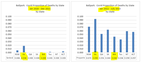
They hadn’t. They had near zero covid across the first two years of the pandemic (left graph - ballpark). They were very late to remove their borders, and thus missed the huge omicron January/February 2022 peak, and across 2022-2023 have had only half the deaths to covid than Victoria, in the ‘proportion of all death’ sense. Victoria has been a winner (by far) on the proportion of their deaths attributed to covid, all four years considered.
Then I wondered if WA had a massive number of vaccine deaths. And then I wondered if this excess was an artifact of a false assumption.
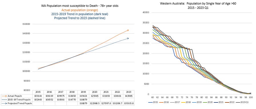
Without analysing for the likely vaccine deaths at this time, there is another explanation for the rise of deaths, being a rise in the number of people in the death susceptible age group, beyond that predicted by the trend. In the left pic below we see that the actual population in the 78+ year old demographic rises far above the 2015-2019 Trend, and the deaths from this excess are being falsely included in the Projected Trend analysis.
Why has this demographic increased? A few reasons… We are currently seeing the pre- and during-war immigration moving into this age category. The post war baby boom is about to push through. They are probably already impacting the death numbers, now at age 77, but the deaths are going to skyrocket in the coming years. There’s also interstate migration and deferred deaths from the low-flu years. I haven’t done a full analysis.
But to do something accurate with these increasing populations I needed a Baseline that could account for them. So, using populations and various forms of death data from the Australian Bureau of Statistics, using smoothed projections in age-specific mortality rates I built the following curves for each state. The data from the Territories was not suitable for this treatment either.
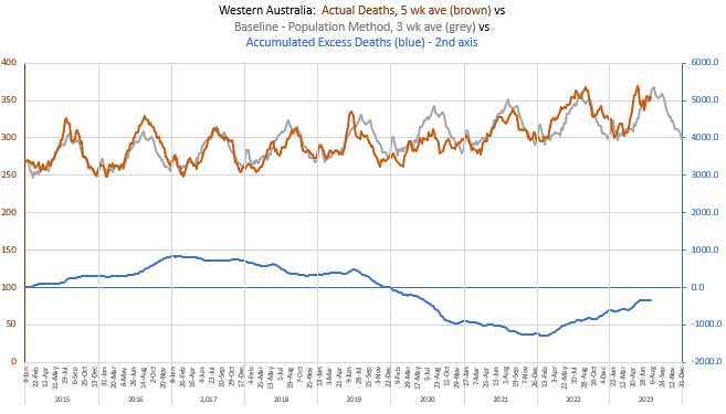
So here we have the actual deaths for Western Australia, matched against the population-derived baseline. Despite the expected vaccine death bubble in 2021 (in the complete absence of flu and covid, and thus low pneumonia), they haven’t had enough covid to accumulate excess deaths above zero, yet (blue line). What’s up with WA? It’s very sunny there - lots of vitamin D?
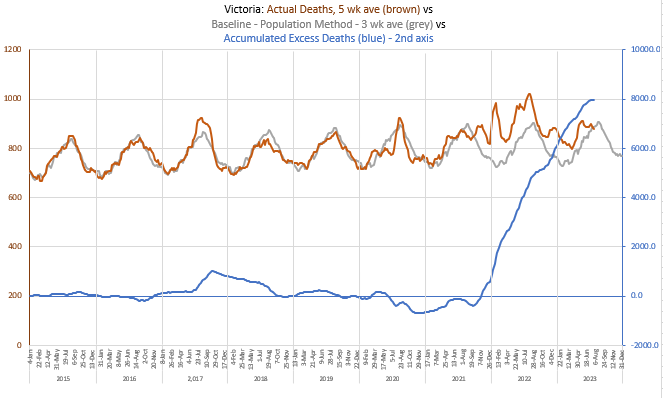
Here is poor Victoria, with nearly 8,000 excess deaths. It’s been a hard time.
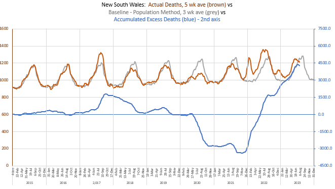
And now the rest of the states…. A modest amount of excess death in New South Wales, given its size - a little less than 4,500.
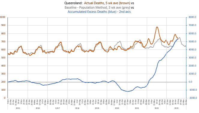
A rather high level of excess death in third biggest state of Queensland - above 5,000.
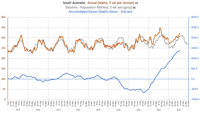
South Australia is almost the same size as Western Australia, but it has gone well into excess death.
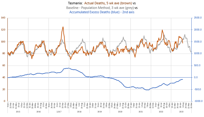
And then Tasmania is also, like Western Australia, below zero, despite a very similar ramping of deaths to Victoria at the likely vaccine administration time in autumn 2021.
To compare the states I gathered the data on the excess for each, and put them together in a similar manner to that as described above. Much the same features emerge, as above, but there are a few different - there’s only one emerging feature I want to point out, but will do it below.
Now, after successfully allowing for actual population movement, I calculated the Accumulated Excess Death (in Standard Deviations) across the pandemic, by state, and got an outcome that surprised me.
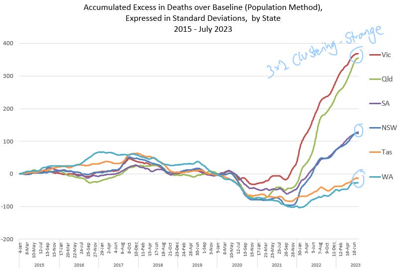
Clustering
As I wrote at the top of this post, I am stunned. Vic & Qld cluster together. SA & NSW cluster, as do Tas and WA. How can one explain this?
The Vitamin D explanation can’t be used in Tasmania, unless everyone there is popping pills. Perhaps WA and Tassie are each lucky for their geographical isolation, less likely to be seeded by covid, but that doesn’t explain the different clustering on the eastern mainland. I would’ve thought Queensland and Victoria were chalk and cheese, north and south of New South Wales, and why should NSW and South Australia cluster, different in everything??
Does it look to you like there could be a little bit of vaccine-mix experiment going on? Or pandemic seeding? It just doesn’t look natural to me.
Did Victoria and Queensland get more Astrazeneca? Victoria was manufacturing it, so, being our product, we had to advocate for it. I remember the various states being accused of not using it enough, and I remember the Queensland Premier Annastacia Palaszczuk saying they were pulling their Astrazeneca numbers.
Emerging feature
There is this little shared bubble of deaths between Victoria and Queensland in the middle of the vaccine rollout, in the complete absence of covid or flu. Take a look…

These bubbles represent about 300 deaths over the mid-April to May period in Victoria, and 430 deaths in Queensland from mid-April through to the end of June. It’s at a magnitude nearly equal to the 2017 flu experience, but we didn’t have any flu. Did we get sent bad batches of Pfizer? Or a transmissible covid injection, given the massive death numbers that followed? I’m just brainstorming here… What happened? Those bubbles aren’t there for nothing. Particularly when Victoria and Queensland have clustered together in a massive rate of excess deaths.
Please, ask any questions and express any doubt. I’m very light on referencing and method because, it’s substack, but I can answer any questions and provide links.
Very interesting!
Great analysis and well explained. I had to read it a couple of times in detail to really appreciate what you’ve done with the data. Looks (to me) like a good way of looking at it.
I had exactly the same thought as you, “What is this?” about the mid 2021 almost simultaneous Vic-Qld bump when I saw it in the graph further up the page. I smiled when I saw your annotation further down 🎯.
The whole post really has me scratching my head for an explanation.