


The Vaccine Deaths are Clear in the Data
In Victoria, people were shot to protect the frail elderly, and then the frail elderly were given the shot. Read it and weep.

[Post-posting read and edit: It’s not a very coherent organisation of the material - once it settles I’ve have another go at it.]
Dear Friends,
The day has come at last where the vaccine deaths in Australia can be seen and quantified.
There’s a method which is simple and elegant. I’d call it magic (in the mathematical/epidemiological sense) though the subject matter is horrible.
The key has been the FluTracker data - the % of Australians with “Fever & Cough”. It has been published from 2019 (image below) but I needed it back to 2015.
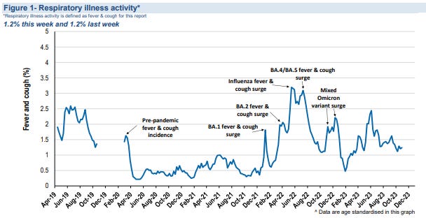
In my “I have a cold” substack I published a request to FluTracker for the data (which they denied) but they’ve published the data anyway, though in graphical form.
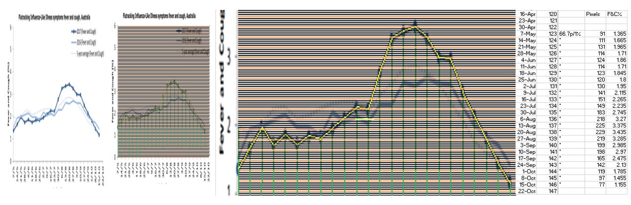
So… (method) I snipped and stretched the graphs from the reports, copied them into paint, counted the pixels, determined the scale, evaluated the Fever & Cough % through the winter months of 2015 - 2018, checked 2019, and then checked the numbers matched the original graphs. The process looked a bit like this, for 2017:
It was laborious, but I’d like the thank the 10s of 1000s of people on the network who regularly enter their health status - couldn’t have done it without you - THANKS! I hope this piece liberates you.
This was the graphical outcome. You can see that 2017 was a bad year for Fever & Cough, peaking higher than our worst year of Flu & Covid in 2022. I’ll leave the pic here for later. You’ll love it.
New Topic: There are 1,000-ways-to-Sunday to calculate Excess Deaths, but I only need three to show the vaccine deaths.
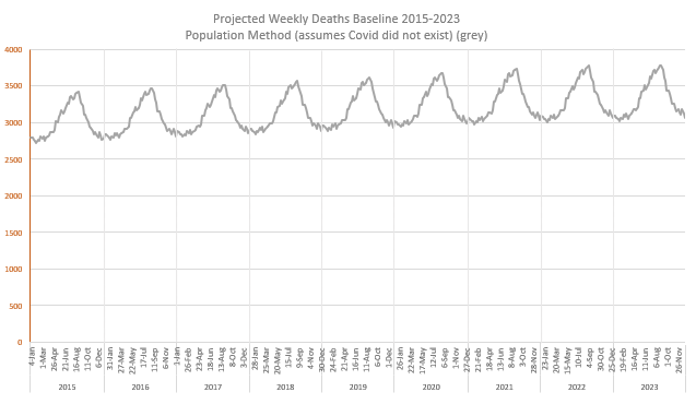
First Technique: Develop a Baseline that projects deaths based on population and age-specific mortality rates, allowing for continued trend improvements.
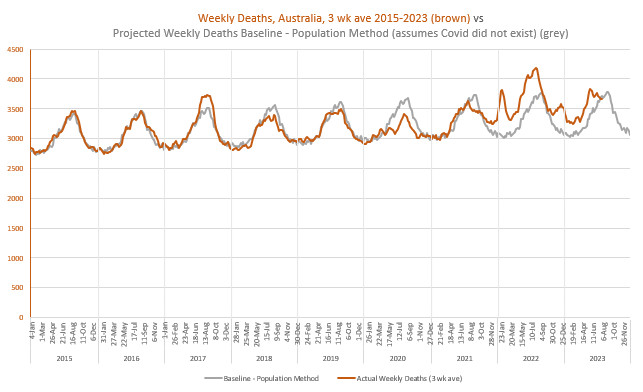
Here is this Baseline, in grey. I projected the deaths annually, and expressed them in the 2015-2019 annual seasonal pattern. I assumed that COVID DID NOT HAPPEN. This Baseline is what would’ve happened if covid and all the measures had not turned up. It has some small flaws. Notice that the deaths in Australia were projected to keep rising, particularly with the arrival of the baby boomers into the age groups with the highest death numbers. Depending on the season we have ~3,000-3,500 deaths a week.
It looks bland, so here are the Actual, reported weekly deaths from the Australian Bureau of Statistics (ABS) Provisional Mortality Statistics (week of occurrence). Note that 2017 had a lot more deaths at peak than the baseline predicted, 2018 and 2019 had a bit less, 2020 had a LOT less, and 2022 had a LOT more. Notice that the wave crests of 2015 and 2016 are similar, as are the crests of 2018 and 2019.
A moment on the wave… deaths happen, relentlessly, in their time, and in a population of 26 million, quite smoothly, in total. But there’s a bit of seasonal discretion. If the wrong flu comes in winter it takes out more than those who were due to die. If it’s a beautiful summer they get a couple more months. Eventually deaths average themselves out. We can see this with the “Accumulated Excess Deaths” in Green below:
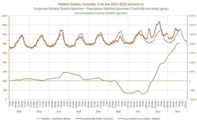
When the deaths are greater than expected the green line rises, and when they are less than expected, it falls. Notice the rise with 2017, back to zero excess deaths by the end of 2019, the plunge from 2020, and the very steep increase from 2021. It finishes with the latest available data at the end of July, at 20,080 excess deaths, but it will be higher because the last few months of death data are incomplete. We’d all like to see that green line turn back to zero.
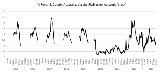
Fetching the Fever & Cough% graph I prepared earlier….
It is Amazing that our population coughing shapes the death crest, and our lack of coughing, the quiet lull. There is a simple message… We Cough, They Die.

With the ordinary, everyday flu across 2015-2019 the coughing predicts the deaths 1 or 2 weeks later. With Covid, the coughing predicts the deaths about three weeks later. Covid - the disease where we were told to wait a week to see if something bad would eventuate.
Coughing went very quiet in Australia from March 2020 until omicron arrived in 2022. We shut the borders, locked down for six weeks, all states but one went to Covid Zero. Victoria had a nasty outbreak in Aged Care and Health (very essential workplaces) that was very difficult to manage. We locked down ALL WINTER INTO SPRING while the authorities tried to manage infected aged care workers working in multiple sites, taking it back home and taking it back out again.
[A note… the Great Barrington Declaration on “protecting the vulnerable” was a lie - we worked So Bloody Hard here in Victoria to recover our situation to “protect the vulnerable” - people were shot at - no-one is going to do that again. It’s an ethical issue that needs discussion, and to the freedom people… You Cough, They Die - face it - there is no “protecting the vulnerable”.]
Moving on…
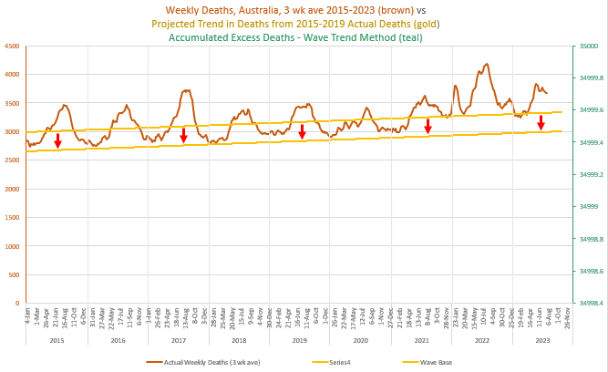
Second Technique of Evaluating Excess Deaths: Project the TREND from the deaths over 2015-2019 into the future, and then calculate the Excess Deaths.
This is a simple method. The trend goes through the death wave, and the Accumulated Excess Deaths are wavy as a consequence. The current Excess Deaths on this method sit at 23,236 (compared to 20,080 above). The difference is mostly a consequence of a different part of the wave cycle. There are small flaws in both methods but they are pretty good. [Post-publication edit: As a result of further investigation detailed here this Trend line has been adjusted up in the pandemic years to account for rises in the susceptible population. After a couple of minor corrections the numbers are currently sitting at 18,285 (compared to 19,663). Graph not adjusted.]

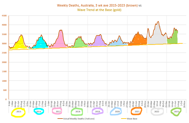
Third Technique: This one is really, really amazing. From here we’ll be able to see what the vaccine excess deaths are.
Move the trend line down so it sits below the wave, thus: [Post-publication edit: This baseline also needed adjusting]
Then count the number of deaths in each wave, for each year. I’ve coloured the waves so they are distinct.
Before the numbers, a necessary interlude…
Interlude: Multiple Causes of Death
People who die at an older age typically die of several causes.
For example, if a person with Dementia, who has lost a lot of muscle control, has trouble eating, gets the flu (or the flu shot), (or the covid shot), gets a fever, coughs, vomits, breathes in the vomit, gets pneumonia and sadly passes away, did they die of Dementia, Flu (or shots), Pneumonia, Musculoskeletal Weakness, or Malnourishment?” One of these causes will be called the Underlying Cause and the others will be called Associated Causes.
People are not frequently given flu and pneumonia as the Underlying Cause of death. This is because it is typically only frail people who will die of such diseases, and frail people have a lot going on.
Covid on the other hand is more likely to be given as the Underlying Cause, even though the death outcomes are mostly confined to the same frail demographic. Additionally, the statistical codes are there to pick up every possible covid-related case. There is
COVID-19 (U07.1-U07.2) - Underlying Cause and Associated Cause
Personal history of COVID-19 (U08) - currently only Associated Cause
Post COVID-19 condition (U09) - currently Associated Cause
Multi-system inflammatory syndrome associated with COVID-19 (U10) - currently only Underlying Cause
Covid might be causing some deathly long-term diseases, and not all recognised at this time, but any doctor who thinks a death could possibly be related has a code to signify that.
Here are the numbers, from 2015-2022 (Deaths Registered).
Freak of Nature, Coding and Mathematics
I consider it a freak of nature, coding and mathematics that, over the years 2015-2020, before the injections began, the total cause attribution to influenza + pneumonia + the extended attribution of covid deaths happens to very closely approximate the total number of deaths in the waves (R2=0.91).
The graphic on the left shows the association over the years 2015-2020, with the R2 value at 0.91. [Post-production edit: This graphic has been updated]
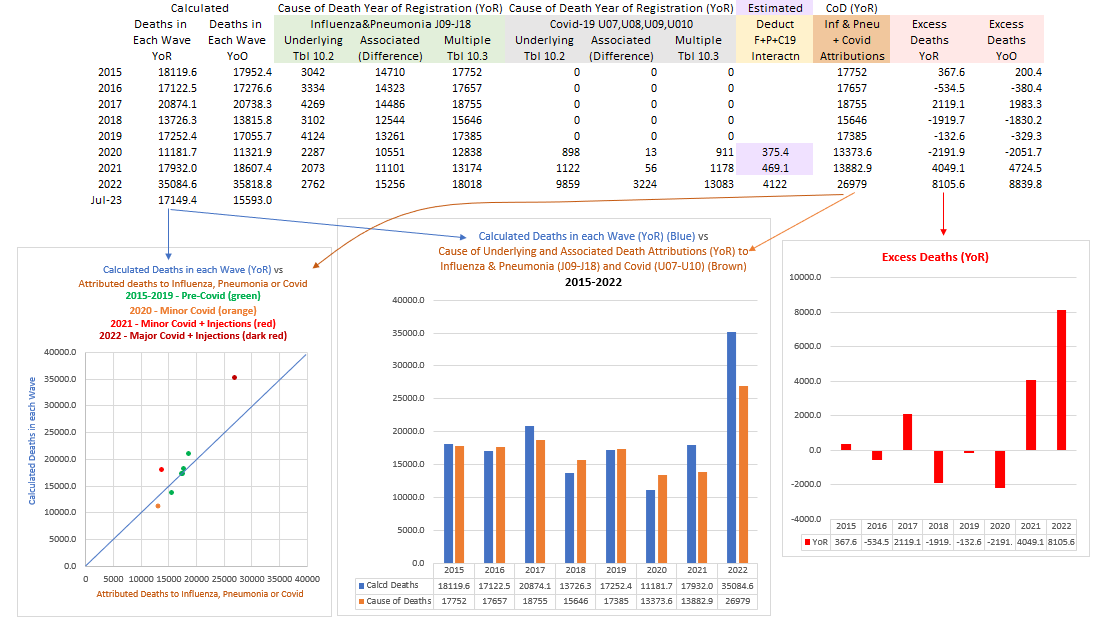
The graphic in the middle compares the deaths calculated in each wave (blue), verses the deaths attributed to influenza, pneumonia and covid.
The graphic on the right shows the Excess Deaths - those that COULD NOT be attributed to flu/pneu nor covid, despite the most ardent hunting.
Having no other reasonable cause, I deduce most of these Excess Deaths (over even covid) to be the vaccine deaths - roughly 5,600 in 2021 and 9,500 in 2022. [Post-production edit: Numbers now saying 4,049 in 2021 and 8,106 in 2022]
It gets “better” (bigger) (clearer)
The actuaries waved their hands at things like ambulance delays and deferred treatment to explain away non-covid excess mortality, but quantified nothing. I’ll investigate this more, but the ambulance ramping/delays around Australia (that I recall) were during the rollout, before covid, and I suggest that any deaths as a consequence should also be attributed to the vaccines. Regarding delayed treatment, I’ve looked at the hospital separations and I haven’t seen evidence of that.
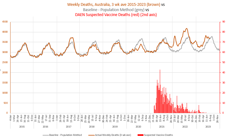
What I have seen is a slab of the evidence for vaccines killing people. There have been about 1,000 suspected deaths reported to the TGA’s DAEN adverse events database. The TGA has acknowledged 14 of them. The doctors/coroners have acknowledged 20 (underlying or associated cause).
I went through the deaths reported to DAEN week by week. Here they are. There were many reported in 2021 but waned off in 2022, although I’m calculating10,000 excess deaths due to the vaccine, so this needs to be considered (later).
For now, let’s see the nature of these deaths. I’ve only been through to April 13, before the peak, and found 55 deaths, 2 in their 60s, 12 in their 70s, 15 in their 80s, 20 in their 90s, 2 were 100, and 4 could not be identified by age.
Here are their reactions, with their age and sex dis-identified.
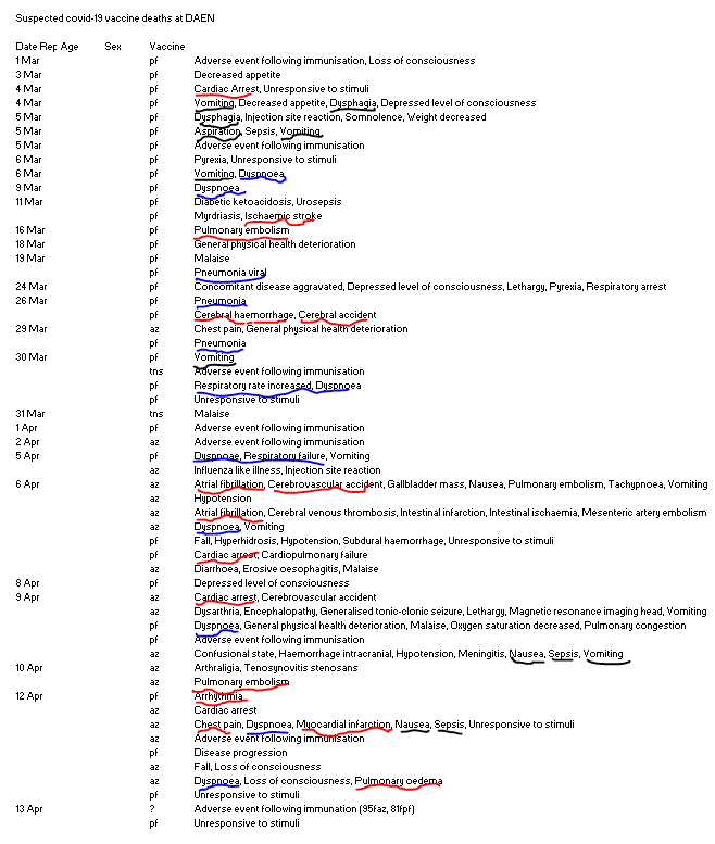
Their reaction reports relate to the circulatory, respiratory, endocrine, digestive systems, and more. But the reactions I’ve taken a particular interest in are in black - those that suggest a frail and older person aspirating their own vomit, and having trouble breathing.
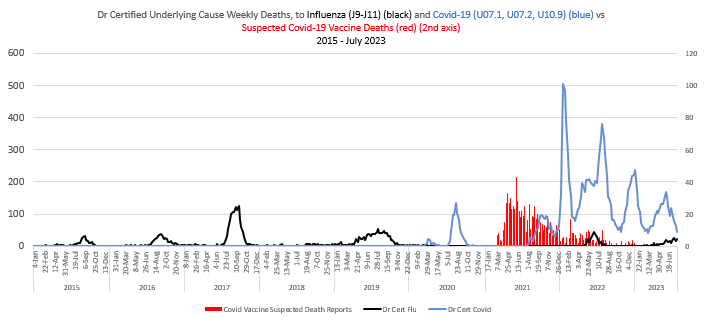
“Pneumonitis due to solids and liquids (J69)” is common enough in the Cause of Death statistics, less so as an Underlying Cause (1,117 in 2021) than as Associated (8,214 in 2021). But there was a distinct shift towards this type of death in 2021.
Recall these Suspected deaths were being reported at a time when there were zero deaths to flu and covid…
Recall, historically low rates of fever and cough…

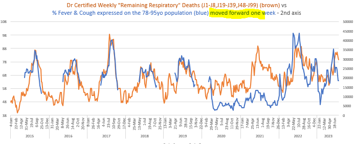
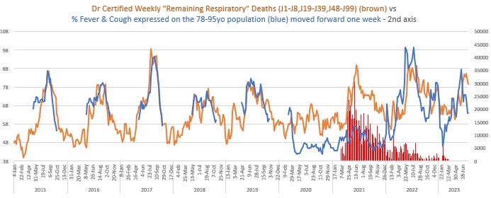
There is a category of Dr Certified Weekly Deaths that can be deduced from data provided by the Australian Bureau of Statistics in their Provisional Mortality Statistics. The ABS provides four series related to the respiratory system - All Respiratory, Influenza & Pneumonia, Pneumonia alone and Chronic Lower Respiratory. From these series it is possible to deduce Influenza alone, Pneumonia alone, Chronic Lower Respiratory alone, and a “remaining” category that I call “Remaining Respiratory”. Now, 95% of this category are certified by Doctors, so I feel confident that this series adequately represents the totals (which include Coroner certified deaths in the annual Cause of Death statistics).
The following graph matches this “Remaining Respiratory” category of death, which includes (J69) Pneumonitis due to Solids and Liquids, matched against the %Fever&Cough series.
It’s beyond incredible how well the %Fever&Cough series represents this category of death over 2015-2019 when moved forward a week or two, and how it represents a lot of the covid a few weeks later.
There’s a lot of space between these series in 2021 though, and, with the help of the Cause of Death statistics I can see 1000s of Associated Cause deaths in this category, above the steady state of the 2020 non-vaccine conditions, viz…
Some people might see the 2021 deaths and suggest that, while there wasn’t any flu or covid, it was winter - people just die then. But to that suggestion I say, look back at 2020 - people didn’t die in winter in 2020. I find this so sad. We protected our frail elderly in 2020 from infection, not from their friend, Winter, with whom they appeared quite content.
I’m going to leave it all here for a moment, to take a break. This effect can be seen to a greater and lesser extent of almost all of the Doctor Certified causes, and at my leisure, I’ll do them. The Multiple Cause of Death statistics are showing sudden increases in many categories, not just J69. Hypertension, Atrial fibrillation, are just two of the places to look.
We locked down for months, people were SHOT AT by the Andrews Government, to protect the frailest of lives through to 2020, to have them taken out by Pfizer and Astrazeneca a few months later.
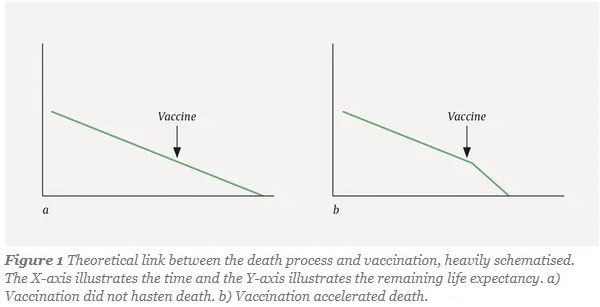
Some of these people might’ve been “due to die” in the 2021 year anyway, within a few months of being killed by the vaccines, as the Norwegians visually expressed with the following graphic when they analysed the deaths of elderly Norwegians to Pfizer, but this only means that these people were already mathematically included under the base of the wave, and that vaccine deaths were actually a lot higher. There is good background reading in Vaccine Deaths in the Frail Elderly - it covers the flu vaccines as well.
To be proof-read and referenced later - I just want to send it off.
Great work Madeleine, interesting breakdown of 2021! One potential valuable addition is to overlay the vax rates over time, e.g. see page 19 of the report from Denis Rancourt and colleagues: https://correlation-canada.org/covid-19-vaccine-associated-mortality-in-the-southern-hemisphere/
“The actuaries waved their hands at things like ambulance delays and deferred treatment to explain away non-covid excess mortality, but quantified nothing. I’ll investigate this more, but the ambulance ramping/delays around Australia (that I recall) were during the rollout, before covid, and I suggest that any deaths as a consequence should also be attributed to the vaccines. Regarding delayed treatment, I’ve looked at the hospital separations and I haven’t seen evidence of that.“
Spot on. 🎯
I’ve also heard this hand wavy explanation given numerous times by many so called professionals not just the actuaries with no supporting evidence. I’ve also looked at it and can’t find any evidence that it is true. Maybe, I missed something (quite possible) but like you I can’t see any evidence in the data that I’ve seen that supports the conventional explanation.